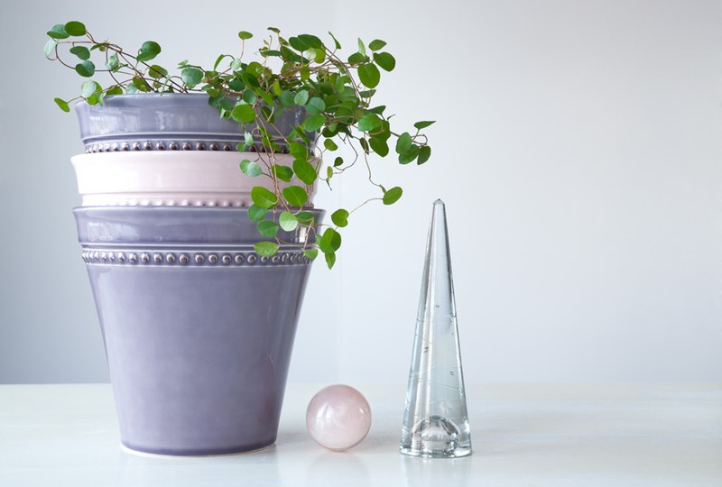
Every year, Pantone – the “global authority on color” – releases its Color of the Year. This hue is adopted by design and fashion houses, interior decorators and big-name brands, who work to envelop the color into new or existing product lines. While it may seem like a fun whim, Pantone’s influence on design, especially within the home, cannot be overstated.
In recent years, the “ombre” trend – which gradually blends two colors into another – has grown popular and is used in everything from clothes to hairstyles and even fingernails. Perhaps, then, it’s no surprise that Pantone has selected two blended shades as its 2016 Color of the Year; together, Rose Quartz and Serenity (a cooler, pale cornflower blue) and their ensuing color blend have been selected for the honor.
To celebrate the Pantone 2016 Color of the Year, we’ve put together a Pinterest board that shows how homeowners can incorporate this unique blend into their home. Whether your abode’s vibe is shabby chic, minimalist or somewhere in between, we’ve found a way for you to fold Rose Quartz and Serenity into the mix. Enjoy!
Follow Edina Realty's board Decorating with Pantone's 2016 Colors of the Year on Pinterest.


 ©2026 Prosperity Home Mortgage LLC®. (877) 275-1762. 3060 Williams Drive, Suite 600, Fairfax, VA 22031. All first mortgage products are provided by Prosperity Home Mortgage, LLC®. Not all mortgage products may be available in all areas. Not all borrowers will qualify. NMLS ID #75164 (For licensing information go to: NMLS Consumer Access at